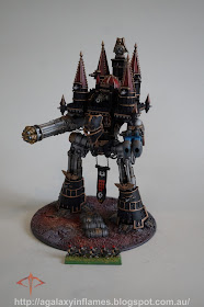
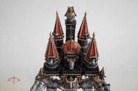
The overall engine stands 155mm tall (a touch over 6" in the old system), making it around 35mm taller than the original kit. This will hopefully give the unit more height to help it stand above the newer Reaver sculpts (which clock in at around 90mm).
The bright red really gives some colour to the rather plain sculpt. 95% of the Imperators and Warmongers I have seen are painted in flat colours all over. That is the way kits were painted in the 90's, our modern styles are very different to the hyper cartoonish styles 20 years ago.
The tabbard is pretty basic, with symbols mostly lifted from the new Iron Warriors decal sheet. I have tried to keep the look of the 28mm scale miniatures, but it is quite difficult.
The base is a 100mm (4") wide custom job, 2mm thick styrene which I machined on my lathe. The power generator I added for some colour, along with the 25mm (1") resin inserts of rock. The gravel and sand was applied and sealed with the AK Interactive Gravel and Sand Fixer.
The wide variety of colours on the base was achieved using the wonderful Secret Weapon Miniatures weathering pigments. The colours used were as shown below, and sealed using their pigment fixer.
The results of a full mottling of all these colours has created a visually vibrant base, which despite being 4" wide is interesting to look at even with almost nothing on it.
No shot of my epic is complete without a comparison shot with my 90's Iron Warriors in fancy Goblin Green based glory.
From this angle, you can really see the new upper legs, which lifted the model by about 35mm. The one down side is the rather static way in which they bond to the greaves, however, that was how it was on the original kit, and rather than lose sight of the original, I decided to echo the style as best I could.
So there it is, the Dies Irae in all her glory. She's big, bad and powerful. I have 4 Reavers and 4 Warhounds planned at this time to fight alongside her, and as a full force, they will actually fit on my display shelf! So, did I get it right, or have my changes negatively affected the model form the 90's? Let me know below.
~Macca


Looks awesome! Overall I like your changes. I think the head doesn't fit though. It needs more small greebling and detail, imo, for it to fit with the model and make it look like a gargantuan war engine.
ReplyDeleteI tossed and turned a lot on it, but in the end I decided that it echos the Warlord Titan really closely, and the old head was just... ugh. The Imperator Titan is a funny one, with a mix of fine detail and poor detail in equal measure, a good 90's sculpt lol
DeleteAlthough I must say that I find the head a bit to big for the titan, the painting is impressive and it diminishes that sensation. I'm digging the matte black and the contrast with the gold. Overall, a fantastic job, and it just makes me envious (in a good way) of not having any epic scale titan, as I wouldn't mind having a small combat group or legion.
ReplyDeleteI found it odd at first, but in proportion to the rest of it, it's the same size as the original. The problem is that the original sculpt has bizarre proportions, and when I increased the arms, legs and head equivalent to one another, the head became quite large on the Titan. But, not to matter, it is what it is now and I enjoy it, she lives on the shelf with my FW greater daemon and my Primarchs.
DeleteHaving a closer a longer look at the pictures, I must agree with you, and actually the size seems quite appropiate, it was just that the full frontal perspective pictures of the previous post made it seem bigger than it actually is. The pictures on this post show different angles and there I could appreciate the real size.
DeleteI do enjoy seeing your titan, so it is only fair for you to enjoy it even more. Looking forward to see your future reavers and warhounds.
I'm really excited, I never owned anything other than a Warlord as a kid, so this is a big deal for me. I will be able to field about 5500 points which is a pretty solid epic army.
Delete