Showing posts with label Paint Schemes. Show all posts

Wednesday, 11 November 2015

Imperial Armour Modelling Masterclass Review

G'day guys, Macca here and I have for you a review for both Imperial Armour Modelling Masterclass books. Since the Horus Heresy Modelling Masterclass is supposedly at the printers, it seems like a good time to look back at these babies. (I actually only got two new copies of my own this week)


Saturday, 24 October 2015

A Galaxy In Flames Video: Decals, Oil Pin Washes and Oil Streaking

So, another day and another video tutorial! Today we are taking a look at applying Decals, Oil Pin Washes and Oil Streaks. I have put this video together with warts and all, if I have trouble mixing a paint, you'll see it, if a decal doesn't apply, you'll see it. This video continues on from the rust effects done in the first video, and aims to take it from a basic, rusty fortification, to a fancy rusty fortification.


I hope you enjoy the video, see you next time!

~Macca


Sunday, 9 August 2015

Great Unclean One

Hey folks, Macca here, and today is something quite different to the recent posts about Legion vs Legion, and how Games Workshop is a few cans short of a 6-pack. Today I'm showing off my recently repainted Great Unclean One. I simply love this miniature, it's one where Forge World captured the feel spectacularly.


The key element in painting this guy was corpses. When I originally painted him, he was more of a brown skin tone, and in hindsight, I needed to go pale, we're talking Twilight pale but without sucking as hard as Twilight. Also, being Nurgle, I wanted to use slime all over the place, to really add to that corrupt feeling. Slime in the mouth, in the large gaping wounds, slime on the sword, in his boils, mmmmmmm yeah, that's ma' Nurgul!


The boils are designed to look like they would on a real person, large and weeping over red blistered flesh. The flesh itself if bruised and swollen around the wounds, whilst it's dark and filthy around his flab rolls, with blues used to great effect.


His actual eyes are a flat white. This is to represent the decayed, cataract  look of an old corpse. Disgusting stuff, but I feel it works.


Nurgles rot anyone? I'm gonna go with poisoned attack here, just got a feeling on it....


The base itself is a Secret Weapon swamp base, embellished with their kit for it. It's hard to see in the pictures as the body of the Daemon creates a lot of shadow over it, but the water is about 2mm deep, with swirls of his Daemonic slime coiling throughout.


Overall, this was a fun project as I got to paint something that wasn't power armour for the first time in a long, long time. It was fast too, only taking me a few hours one night, and it now gives me a fun model I can use in the Calth missions from Book V: Tempest.

~Macca

Thursday, 25 June 2015

Macca's New Table + General Terrain Thoughts

G'day folks, Macca here and today I'm going to talk about my new table, as well as some of my opinions on table setup. First up, the whole table is a Games Workshop Sector Imperialis, with almost entirely GW terrain (the fuel dump is from Forge World's Anphelion Base, and the crane is a scratch build of mine).


When designing this table, I had two key considerations:
-near symmetry
-unique buildings

The idea with a good table is that the sides should be pretty balanced. There's nothing worse than what I call 'Omaha Beach' tables, where one poor sod gets placed in an open field and the other guy deploys inside a fortress. Yes, by the way, I have seen it first hand at a tournament, a marine player was set up in open ground whilst a guard player had 3(!) fortresses of redemption to set up in, needless to say, that was a bit f%&ked.

So, that in mind, each side has 3 main buildings, a pair of craters, a pair of shared central buildings designed to block LOS so that total dakka forces can't just have their way (there are plenty of open areas, but you have to work for them, you can't just rock up and play like the Tau). I also added some unique buildings.

Unique buildings? Well, the idea here is that if I want to add a little extra depth to my games, such as a narrative campaign, these buildings can have special rules and/or be objectives in their own right. I have:
-Water Plant  (a single unit inside here gains FnP 6+, does not apply to MC's)
-Chemical Plant (one infantry or MC unit occupying these ruins counts as having shroud bombs and rad grenades)
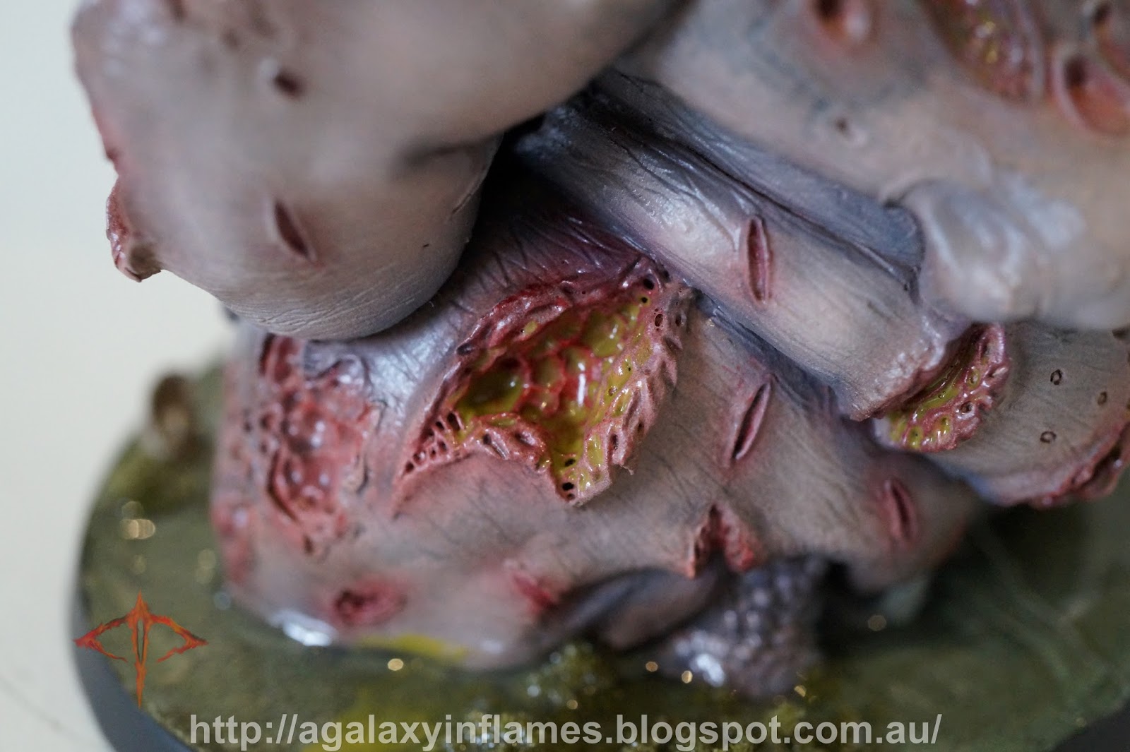
-Fuel Dump  (chance to ignite when a unit occupying the dump or using it as cover is shot by a weapon S7 or over, or a weapon with the flamer rule type, on a roll of a 5+. A large blast S4 AP4 is placed anywhere on the dump by the player who ignited the dump)
-Power Plant (add the twin-linked rule to heavy-type las or lance weapons on infantry or MC units if they hold the building uncontested)
-Crane (grants line of sight to the entire map if held for the purposes of barrage weaponry line of sight)

These buildings have some crazy rules, so you can exploit them if you like, and it makes them worth capturing if you can, as much like a real battle, they represent some great objectives. A unit of Castellax with Darkfire Lances holding the power plant? DEATH. Anyway, you don't have to use any of my rules, you can instead use the Book I and IV cityfighting rules and ruins charts.

 STREET SIDE 1

This side of the street houses two of the unique buildings, the Water Plant, as well as the Crane. Two regular buildings, a large broken aquilla and a pair of craters. The power plant is shared between the two sides, as is the large central ruins.

 STREET SIDE 2

On this side of the street, the second half of the power plant is in place, as well as the Fuel Dump and Chemical plant. Two regular buildings, a large marine statue and the last pair of quake craters finish this side.

Here is the crane and fuel dump, as well as a good overview of the large (and very symmetrical)  central building.  The water plant is directly behind the crane as shown.

At this end, the board is relatively open for line of sight, that said however, it also has numerous objects which can be used as cover. (Not including my dice and templates of course.)

The central ruin straddles these twin aquillas. Good ol' Games Workshop, can only make something grimdark with skulls or eagles.

Speaking of which.... SKULLS FOR THE SKULL GOD. I uh, I mean, uh...

I chose to use dull brasses to create the reliefs, using some Thallax Gold from Forge World and some Copper from Minitaire, with several washes of the GW technical paint Nihilakha Oxide. I have a bunch of old bronze and brass floating around here thanks to work (no I'm not stealing it, I recondition it for those wondering) so I was able to do a fairly true-to-life weathering effect.


The quake craters are a very simple scheme, simply designed to suit the board. They are very subdued, and I tried to use as little colour as possible. Every manhole (personhole to any politically correct douche bags) cover is painted in a soft bronze, and heavily tarnished (these things do sit in the street corroding for years and years).

Anyway, I hope you enjoy the table, as well as my crazy ideas for it,

~Macca

Saturday, 20 June 2015

Forge World Metallic Airbrush Paint Set: Quick Review

G'day guys, Macca here. Tonight I want to take a really quick look at these new paints. I had several arrive last week (to be honest, this very bundle), along with a bunch of Minitaire and GW paints, so I will launch into a quick two cents on them. (Note: I only tested the metallic paint range)


So, I primarily used Iron Hands steel, as I have been working on my Iron Warriors and it's a close enough match to the Tamiya Titanium Silver I have been using. Overall, I liked it as it was easy to use and was a very clear colour, and I was able to paint a Deredeo, 3 Rapiers and 5 Vorax with them no dramas whatsoever.

As I also painted my new Sector Imperialis table, I used the Thallax gold in some places on my large aquillas. It's a good colour, however it simply wasn't lasting for that job, and I chose to use Minitaire instead to finish that particular job. This leads me to my next section:

Pros and Cons

Pros:
-solid colour, the metallic particles don't separate leaving you with that horrible clear filler liquid
-colours are pretty well matched to their assigned jobs (Grey Knight Silver suits Grey Knights funny enough)

Cons:
-not a dropper bottle, which f#%king sucks
-price. This is a big one, as you can get more for less from pretty much any other airbrush brand in regular usage, such as Vallejo Air, AK Air, Minitaire etc.
-no noticiable improvement over Vallejo Air or AK

General Thoughts

I think these are really good paints. I also think they are price gouging you for what they deliver, as the pros are pretty much covered by other brands, brands that don't have the negatives. Sure, it's really convinient to buy Emperors Children Purple, rather than try and match the purple of other brands, however, for the price of this set of just 5 paints, I brought 10 Minitaire paints from badger at 30mL each. You do the math, and that's 300mL of airbrush paint for the same cost as 100mL from Forge World. Yuck.

Now, the prices may be better in the UK and offer a more favourable comparison, however here in Australia, I find myself seeing zero advantage to them.

Lastly, don't buy their airbrush cleaner, don't buy their thinners, because I can buy 250mL of each at Toyworld here in Australia for $11.99 each, which, again, is roughly half the price of Forge World and I also don't have to pay to ship them. Oh, and no, I did not test these products, but I don't think they are going to offer much of an improvement over Tamiya, AK, Vallejo etc. as they are all paint manufacturers and they all make great paints.

Verdict/ TLDR:

Great paint, but other people do the same product for cheaper. I favour no particular brand, I like what works for me, so this is entirely subjective, but if you have ever used Vallejo Air, these paints are almost identical.

~Macca

Tuesday, 19 May 2015

Iron Warriors and Terrible Decals

I know what you're thinking, "What kind of a title is that? Are his decals crappy and yet he's showing off his squad?" The answer is kinda yes.

Hi guys, Macca here, and today I am going to show you my new tac squad, aka what a month of procrastination looks like. However, I am quickly going to change topics and go into talking about Games Workshop decals about halfway through.


I decided to change to black rims on the bases this week, I really like the brown, however I felt I just wasn't getting the contrast, they honestly looked like a 70's apocalypse movie, just brown on brown. Too boring.


The paint job is nothing too interesting, I know, but these are currently only tabletop quality. Down the track I will add some scratch marks to go with the armour chipping, I will also do more highlights on the flesh on the bare head. As it is, I'm wanting to get this army to playable in the quickest fashion, rather than going straight at a Golden Daemon.


Angry Macca and Shitty Decals:

So, at this point, let's swap topics. I used a mix of decals on these models. I used Forge World ones on the knee (for the squad number) and the right shoulder (for unit type). Then I decided, in a truly stupid clusterfuck moment, worthy of derision, that I would use the 40k Iron Warrior emblems on the shoulders, rather than embossed pads. Rookie, so very, very rookie.


This is one of the better decals, yet you can clearly see the edges of the decal in this image, about a quarter of a millimeter from the silver, however, that's an optical illusion, more on that later.

On the squad Sergeant, you can also see some crinkles on the cranium of the skull. This is despite a ton of decal thinner and a lot of time spent working on each decal (4-5 times as long as any other decals).

By contrast, this Forge World decal is almost flawless.

The Problem:

Take a look at these decals. The decal areas are far larger than the item printed onto them, this means you will need to trim. Not just that, the decals are very thick, making them incredibly hard to apply smoothly.


Further to that, have a look up close. See anything odd? That's right, that's the silver skull and the black features not lining up. This is something I didn't notice until I applied them to the miniature, as the silver blends into the pale background of the decal sheet. This then led me to 'paint' over any overhanging silver, leading to the optical illusion that the emblem is nowhere near the edge of the decal, despite my trimming.

These Black Legion emblems are perfect examples of shit printed decals.

What is this? Seriously? That's a vehicle decal, that gap is almost a millimeter!

This set of Ultramarine symbols are almost not even printed onto the decal area!

I thought at first I just had a bad batch. Then I decided to go through my decal collection (It's a big one) and I realised that every chaos decal sheet, collected from 2003-2014 (when I gave up on 40k) are all this bad. This is not isolated at all, these are very poor quality decals.

The Actual Point?

Now, I know, I whinged and moaned all the way down this page. But in the end, my point is this:

Don't use Games Workshop infantry decals. They are shit, they will potentially ruin your expensive models.

You see, I am providing context here, it's no good me just saying "these suck", it's important for me to actually show why. This is 'bitching with a purpose'.

Anyway, all this aside, I am pretty happy with the squad, the second tac squad is in a similar state, so I have no choice but to continue on and do the best I can with them. I'd like to know how other people have dealt with this problem. Has it ever come up? Have you tried your best, followed the tutorials and yet the decals don't work? Please let me know, I' love to hear your stories.

~Macca

Sunday, 17 May 2015

A Galaxy In Flames Video: Marble Basing Tutorial

Wow, so some big news today, with Keepy looking at getting some very talented painters, one of whom has painted for Forge World, down here to Australia just to run some painting tutorials! Very exciting stuff! (If you do want to know more about that, please look on our Facebook page or on Australian 30K Heresy Community).

Well, enough of that, and onto today's blog update: a new video tutorial!

Yes, I took the time today to make a beginners guide to creating marble effects on a miniature's base, similar to the effects on Horus and Guilliman's bases.


If you like the video, let us know either here or on YouTube. Thanks for popping in,

~Macca

Narik Dreygur, Praevian Consul of the Iron Warriors: Part 2

Wow, hasn't a lot happened already this weekend? (That's of course for our overseas bloggers, for those of us here in Australia, it's actually closer to Monday than Friday now). Anyway, enough of that, here's what you came here to see: Narik Dreygur!


This miniature is incredibly detailed. Something approaching the actual Character Series, in my humble opinion! Check out the grim specter of death emblazoned onto his tabbard.

I also elected to paint some knee hazards, something I don't often do. After painting it and comparing it to the Forge World model, I noticed that's exactly how they did it too!


There are also 3 distinct gouges I have painted onto his power fist. I'm gonna call these the Wolverine marks.


This lens on his pistol is absolutely tiny. It was a bitch to paint, but in the end, I got there.

A Praevian Consul in all his glory.

Check out his banner....

What do you think? If you want to know how I did any particular, please feel free to let me know. Also feel free to leave feedback in general. Also, a shout out to Eadwine for supplying me with this miniature. Without him, I couldn't have got it without paying some price gouging fuck my first born baby, so cheers for that mate!

~Macca